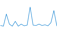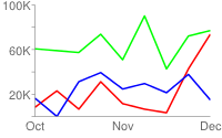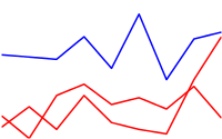
This document describes the various types of line charts that you can create using the Chart API.
Table of Contents
Chart-Specific Features
|
Standard Features
|
Chart Types (cht)
There are a variety of line charts that you can create. Specify a line chart with the following syntax:
Syntax
cht=<chart_type>
Where <chart_type> is one of the the following
types:
| Parameter | Description | Example |
|---|---|---|
|
A line chart where data
points are spaced evenly along the x-axis. Axis lines are shown
by default. To show values on the axis lines, you must specify |
|
|
Similar to |
|
|
Lets you specify both x- and y-coordinates for each point, rather just the y values. To specify data points for chd=t:<line_1_x1>,<line_1_x2>,...|<line_1_y1>,<line_1_y2>,...|
<line_2_x1>,<line_2_x2>,...|<line_2_y1>,<line_2_y2>,...
To space the data points evenly along the x-axis only, provide a single undefined value for the x set for that series. In this example, the red "Unicorns" line spaces the data points evenly along the x-axis. For more information about undefined values, see Data formats. In this example, the "Ponies" line specifies exact x- and y-values for all points, and the "Unicorns" line spaces the values evenly along the x-axis. Note: If you are creating a compound |
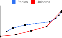 cht=lxy |
Data Granularity
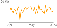
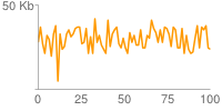
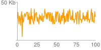
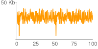
Take care not to overestimate the number of data points required for your line chart. For example, to show how popular chocolate ice cream was over the last ten years, aggregating search queries for each day would result in more than 3,600 values. It would not make any sense to plot a graph at this granularity. On a chart 1024 pixels wide, one data point would be about a quarter of a pixel. (Additionally, this would be too much data to pass in a URL). The following examples illustrate this point.
200 pixel wide chart with 40 data points (5 pixels per data point):
80 data points (only 2.5 pixels per data point):
150 data points (only 1.3 pixels per data point):
300 data points (less than 1 pixel per data point):
Series Colors chco
You can specify the colors of a specific series, or all series, using the chco parameter.
Syntax
chco=
<color_1>, ... <color_n>
- <color>
- An RRGGBB format hexadecimal number. Specify a single value to apply the same color to all series. Specify different colors for different series by adding color values separated by a comma. If you have fewer colors than you have series, the unspecified series will cycle through the specified colors from the beginning.
Examples
| Description | Example |
|---|---|
When you specify a single color for each series, each series gets the color assigned. This example has three data series and three colors specified. |
|
This example also has three data series, but only two colors are specified. Because the color for the third series is unspecified, the third line is drawn using the first color (red). |
|
Compound Charts
You can add lines, candlesticks, and shape markers to a line chart to make a compound chart. See Compound Charts for more details.
Standard Features
The rest of the features on this page are standard chart features.


