This document explains how to send your chart data to the Chart API.
Table of Contents
Overview
Data for almost all charts is sent using the chd parameter.
The data must
be sent in one of the following formats:
- Basic text format is essentially simple floating point numbers from 0—100, inclusive. This format is easy to read and write by hand.
- Text format with automatic scaling scales the chart to fit your data.
- Text format with custom scaling is similar to basic text format, but it lets you specify a custom range using a second URL parameter.
- Simple encoding format lets you specify integer values from 0—61, inclusive, encoded by a single alphanumeric character. This encoding results in the shortest data string of any of the data formats (if any values are greater than 9).
- Extended encoding format lets you specify integer values from 0—4095, inclusive, encoded by two alphanumeric characters. Extended encoding is best suited to a chart with a lot of data and a large data range.
The data values are scaled to fit the format used; see Data Scaling and Axis Scaling for an explanation of how the data is manipulated to fit the chart.
We provide a JavaScript snippet for encoding data into simple encoding or extended encoding formats. Alternatively, several Chart API Group members have contributed other libraries to help with formatting: search the Group archives or visit the related links page on the google-chart-api group site to find them.
Basic Text Format
Basic text-formatted data lets you specify floating point values from 0—100, inclusive, as numbers. Values below zero are marked as missing; values above 100 are truncated to 100. The advantage of basic text format is that the values are easy to read and understand in the URL, and the default axis labels show the data values accurately. However, text formatting (whether simple or with custom parameters) results in the longest data string of all formats.
If your data includes values outside the specified range for text formatting, you can scale your data by converting it into percentages of the largest value in your data. Alternatively, you could use text formatting with custom scaling to handle the scaling for you.
Syntax:
chd=t:val,val,val|val,val,val...
- <data>
- Each series is one or more comma-separated values. Separate multiple series
using a pipe character (
|). Values are floating point numbers from 0—100, inclusive. Values less than zero, or the underscore character ( _ ) are considered null values. Values above 100 are truncated to 100.
Example:
| A table with five values. The underscore is considered a null value, the -30 value falls below the minimum value, so it is dropped, and the 200 value is truncated to 100. | 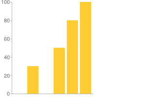 chd=t:_,30,-30,50,80,200 |
Text Format with Automatic Scaling
You can configure some charts to scale automatically to fit their data. The chart will be scaled so that the largest value is at the top of the chart and the smallest (or zero, if all values are greater than zero) will be at the bottom.
Any marker values shown on the chart will display their actual values, not their scaled values.
This feature works only with text-formatted values, and does not work with all chart types. Experiment with your chart type to see whether it is supported.
Syntax
cht=t:val,val,val...
chds=a
Examples:
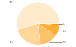
Note that pie you should not use values < 0 for pie charts. |
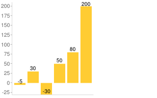 chd=t:-5,30,-30,50,80,200 |
Text Format with Custom Scaling
Text format with custom scaling lets you specify arbitrary positive or negative floating point numbers, in combination with a scaling parameter that lets you specify a custom range for your chart. This chart is useful when you don't want to worry about limiting your data to a specific range, or don't want to scale the data manually to fit nicely inside a chart. This format will adjust the zero line for you, as necessary. The format of the data is the same as with basic text format.
For automatic scaling, specify chds=a.
Text formatting (whether simple or with custom parameters) results in the longest data string of all formats.
Syntax:
Text formatting with custom scaling requires two parameters:
chd=t:val,val,val|val,val,val
chds=<series_1_min>,<series_1_max>,...,<series_n_min>,<series_n_max>
- chd=t:<data>
- Same as plain data format: one or more comma-separated values per series,
multiple series separated by a pipe character (
|). The range of permitted values in each series is specified by thechdsparameter. - chds
- A set of one or more minimum and maximum permitted values for each data
series, separated by commas. You must supply both a max and a min. If you
supply fewer pairs than there are data series, the last pair is applied to
all remaining data series. Note that this does not change the axis
range; to change the axis range, you must set the
chxrparameter. Valid values range from (+/-)9.999e(+/-)199. You can specify values in either standard or E notation.- <series_1_min>
- The minimum allowable value in the first series. Lower values are marked as missing.
- <series_1_max>
- Maximum allowable value in the first series. Higher values are truncated to this value.
Example:
A bar chart with a min/max scale of -80—140. The 30, -60, 50, 140, and 80 values fall within the scale, so they are not truncated. Note that the zero line is adjusted for you, 80/(140 + 80) = 0.36 of the way up the y-axis. Also note that the default y-axis range is still 0—100, despite
the |

|
Simple Encoding Format
Simple encoding format lets you specify integer values from 0—61, inclusive, encoded by a single alphanumeric character. This results in the shortest data string URL of all the data formats. However, if you have a line or bar chart that is longer than 100 pixels along the data axis, you might want to use another format. This is because, with only 62 data values supported, the data granularity is much bigger than the display granularity, and values will be just little off (not much, but visible on larger charts).
Note that if you use the chds parameter with simple encoding, data element size
on the chart won't be affected, but any data point marker values will be.
Syntax:
chd=s:
  <series_1>
    ,...,
  <series_n>
- <series_1>
- A string, where each character is a single data point, and series are delimited by a comma. Individual values within a series are not delimited. Here are the supported data characters, and their corresponding values:
A—Z, whereA= 0,B= 1, and so on, toZ= 25a—z, wherea= 26,b= 27, and so on, toz= 510(zero)—9, where0= 52 and9= 61- The underscore character (
_) indicates a missing value
You can use the following tool to encode a single value, or the JavaScript code to scale and encode an entire URL string.
| Plain Text |
|
Encoded Text |
Example:
Equivalent to the text-encoded string chd=t:1,19,27,53,61,-1|12,39,57,45,51,27 |
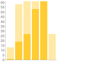 chd=s:BTb19_,Mn5tzb |
Extended Encoding Format
Extended encoding format lets you specify integer values from 0—4095, inclusive, encoded by two alphanumeric characters. It uses a slightly different syntax from simple encoding.
Note that if you use the chds parameter with simple encoding, data
element size on the chart won't be affected, but any data
point marker values will be.
Syntax:
chd=e:
  <series_1>
    ,...,
  <series_n>
- <series_1>
- A string where each two characters is a single data point, and series are delimited by a comma. Individual values in a series are not delimited. Here are the supported encoding characters:
A—Za—z0—9- period (
.) - hyphen (
-) - Missing values are indicated with a double underscore (
__).
Here is an abbreviated description of encoded values:
AA= 0,AB= 1, and so on toAZ= 25Aa= 26,Ab= 27, and so on toAz= 51A0= 52,A1= 53, and so on toA9= 61A-= 62,A.= 63BA= 64,BB= 65, and so on toBZ= 89Ba= 90,Bb= 91, and so on toBz= 115B0= 116,B1= 117, and so on toB9= 125B-= 126,B.= 1279A= 3904,9B= 3905, and so on to9Z= 39299a= 3930,9b= 3931, and so on to9z= 395590= 3956,91= 3957, and so on to99= 39659-= 3966,9.= 3967-A= 3968,-B= 3969, and so on to-Z= 3993-a= 3994,-b= 3995, and so on to-z= 4019-0= 4020,-1= 4021, and so on to-9= 4029--= 4030,-.= 4031.A= 4032,.B= 4033, and so on to.Z= 4057.a= 4058,.b= 4059, and so on to.z= 4083.0= 4084,.1= 4085, and so on to.9= 4093.-= 4094,..= 4095
You can use the following tool to encode a single value, or the JavaScript code to scale and encode an entire URL string.
| Plain Text |
|
Encoded Text |
Example:
Equivalent to the text-encoded string chd=t:90,1000,2700,3500|3968,-1,1100,250 |
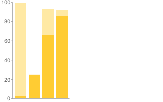 chd=e:BaPoqM2s,-A__RMD6 |
Data Scaling and Axis Scaling
Data is scaled to fit your chart, either explicitly (when using text format with custom scaling) or implicitly (all other types). This means that each chart is scaled to fit the available range of the format, not the actual range of the data that you supply.
You might want to scale your data so that it spans the full range of values allowed by your format, to make differences more obvious. You can scale your data either by scaling your data to fit within the format that you use, or by explicitly specifying the data range (that is, use text format with custom scaling).
Note that the axis label values are calculated on a completely independent scale and have nothing to do with the data values, but use the default range of 0—100. However, you can change that range.
This section describes both of these issues.
Data is scaled to fit the format range [All charts except Pie and Venn]
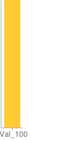
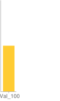
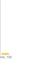
Different formats support different value ranges. Your data is scaled to your format range, so that the maximum value supported by your format is rendered at the top of that axis, and the minimum value for your format is rendered at the bottom. The following examples show the same value (100) using basic text format (range 0—100), text with custom scaling (custom range of 0—200), and extended encoding format (range 0—4095).
| Basic Text Format | Text Format with Custom Scaling | Extended Encoding Format |
|---|---|---|
 |
 |
 |
Value: 100 ( Format range: 0—100 The 100 is rendered as 100/100 up the scale. |
Value 100 ( Format range: 0—200 The 100 is rendered 100/200 up the scale. |
Value: 100 ( Format range: 0—4095 The 100 is rendered as 100/4095 up the scale. |
An easy way to scale your data to fit your chart is to use text format with scaling. A more involved method is to manually scale your data to fit within the range supported by your format.
Pie and Venn Charts: With pie and Venn charts, all values are relative to each other, not to the total scale of the chart.
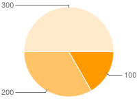 |
 |
chd=e:BkDIEs |
chd=t:100,200,300 |
Axis label range is calculated independently [Bar, Line, Radar, Scatter, and Candlestick]
You can choose to display axis values by using the chxt parameter.
However, it is important to note that axis labels are not calculated to reflect
the chart data, but are either calculated independently by the API, or specified
explicitly by you.
The default axis range is 0—100, regardless of data values or data scaling. So, for example, if you display the y-axis using default axis labels on a chart that uses extended encoding (range 0—4095), the y-axis labels will still read 0—100 unless you change that explicitly, as explained below. Here's an example showing the default y-axis labels in an extended encoding bar chart with a data value of 100:
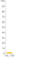
chd=e:Bk (equivalent to chd=t:100)
However, you can specify the axis range using chxr parameter.
If you want the axis values to reflect actual data values, you must specify minimum
and maximum axis values that match your format range. Note that the basic text
format has a scale of 0—100 already, so if you are using
basic text formatting (without custom scaling), the axis values will match data
values by default. Let's illustrate this
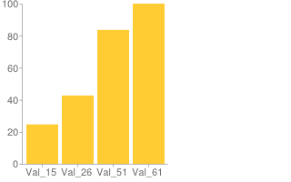
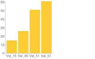
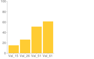
with a few examples. Here are three charts with the same data (15,26,51,61), but
different formats and different axis scales:
| Simple Encoding, No Axis Scaling | Simple Encoding, Scaled Axis | Basic Text, No Axis Scaling |
|---|---|---|
 |
 |
 |
Simple encoding value range: 0—61 Default axis range (0—100) Encoding range is smaller than the label axis range, so the bars don't correspond to the actual value on the axis label. However, the bars are properly proportioned to each other. |
Simple encoding value range: 0—61 Axis range explicitly set to 0—61 Encoding range and axis range are equal, so the bars correspond to their correct value on the axis. |
Basic text format value range: 0—100 Default axis range (0—100) Encoding range and axis range are again the same, so the accurate data values are shown on the axis, by default. Because the text format range is larger than the simple encoding format range (100 units vs 61 units), bars are smaller here than in the other charts, but all charts remain in proportion to each other. |
JavaScript Encoding Script
For real-world use, it is probably easier to encode data programmatically rather than manually.
The following snippet of JavaScript encodes a single series into simple or extended encoding,
and scales data values to fit within the complete range of that encoding. The data
must be provided as an array of positive numbers. Any value provided that is
not a positive number is encoded as a missing value by using the underscore character
(_).
var simpleEncoding =
  'ABCDEFGHIJKLMNOPQRSTUVWXYZabcdefghijklmnopqrstuvwxyz0123456789';

// This function scales the submitted values so that
// maxVal becomes the highest value.
function simpleEncode(valueArray,maxValue) {
  var chartData = ['s:'];
  for (var i = 0; i < valueArray.length; i++) {
    var currentValue = valueArray[i];
    if (!isNaN(currentValue) && currentValue >= 0) {
    chartData.push(simpleEncoding.charAt(Math.round((simpleEncoding.length-1) *
      currentValue / maxValue)));
    }
      else {
      chartData.push('_');
      }
  }
  return chartData.join('');
}

// Same as simple encoding, but for extended encoding.
var EXTENDED_MAP=
  'ABCDEFGHIJKLMNOPQRSTUVWXYZabcdefghijklmnopqrstuvwxyz0123456789-.';
var EXTENDED_MAP_LENGTH = EXTENDED_MAP.length;
function extendedEncode(arrVals, maxVal) {
  var chartData = 'e:';

  for(i = 0, len = arrVals.length; i < len; i++) {
    // In case the array vals were translated to strings.
    var numericVal = new Number(arrVals[i]);
    // Scale the value to maxVal.
    var scaledVal = Math.floor(EXTENDED_MAP_LENGTH *
        EXTENDED_MAP_LENGTH * numericVal / maxVal);

    if(scaledVal > (EXTENDED_MAP_LENGTH * EXTENDED_MAP_LENGTH) - 1) {
      chartData += "..";
    } else if (scaledVal < 0) {
      chartData += '__';
    } else {
      // Calculate first and second digits and add them to the output.
      var quotient = Math.floor(scaledVal / EXTENDED_MAP_LENGTH);
      var remainder = scaledVal - EXTENDED_MAP_LENGTH * quotient;
      chartData += EXTENDED_MAP.charAt(quotient) + EXTENDED_MAP.charAt(remainder);
    }
  }

  return chartData;
}
To encode data, call the simpleEncode or extendedEncode function,
passing in the array which contains your data (valueArray), and the
maximum value of your data (maxValue). To create some space between
the highest value and the top of the chart, set maxValue to be larger
than the largest number in the data array, as follows:
var valueArray = new Array(0,1,4,4,6,11,14,17,23,28,33,36,43,59,65);
var maxValue = 70;
simpleEncode(valueArray, maxValue);

